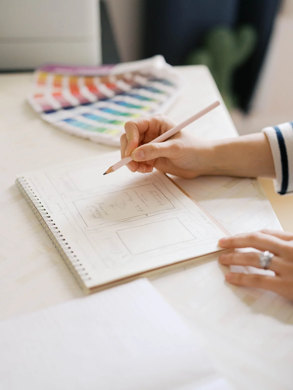

When I say there are no words… I mean it. The depths of creativity were reached with this suite, possibly the best and move involved work I’ve ever done for a client. My husband and I became great friends with Becky and Nate, and Becky and I regularly have craft nights to this day because we just love sharing our creative energy.
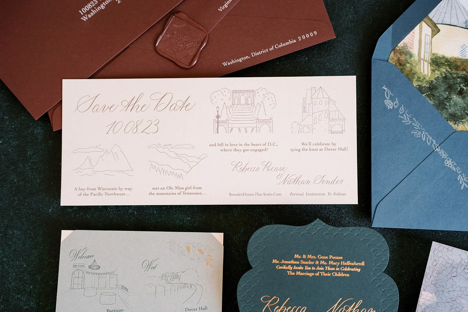
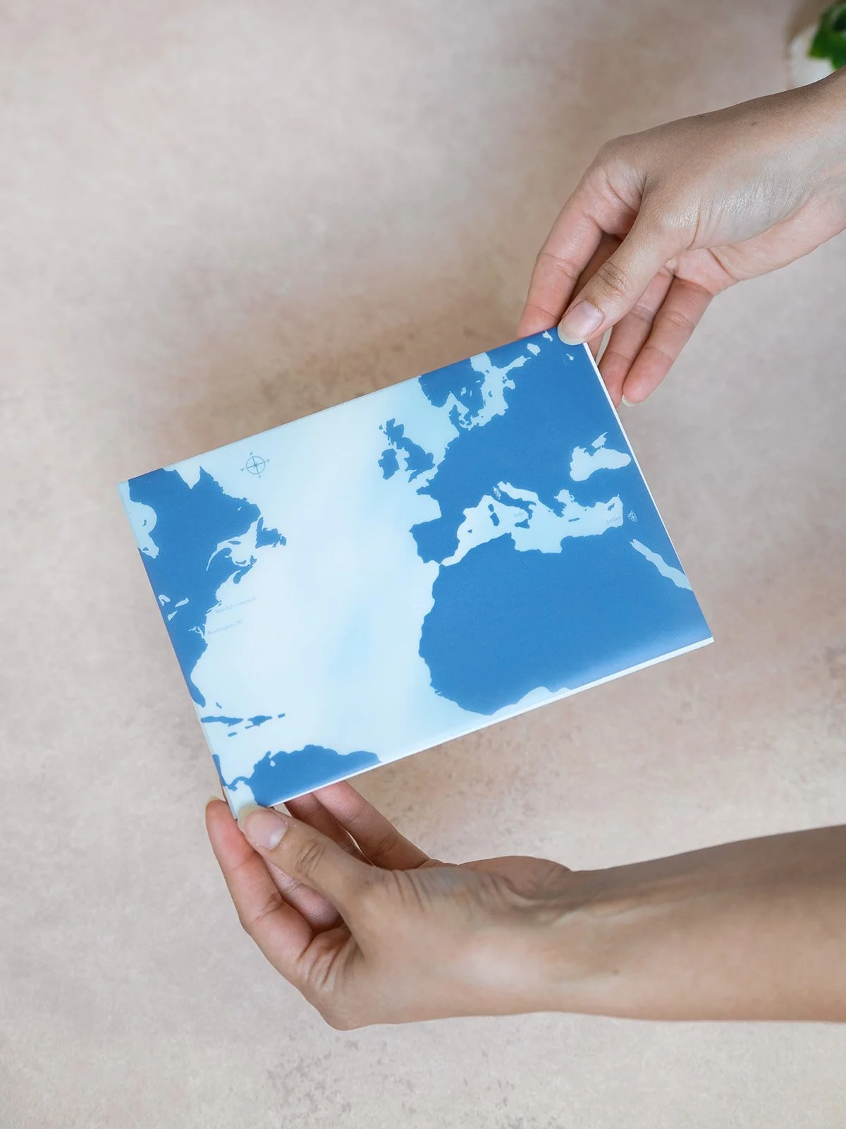
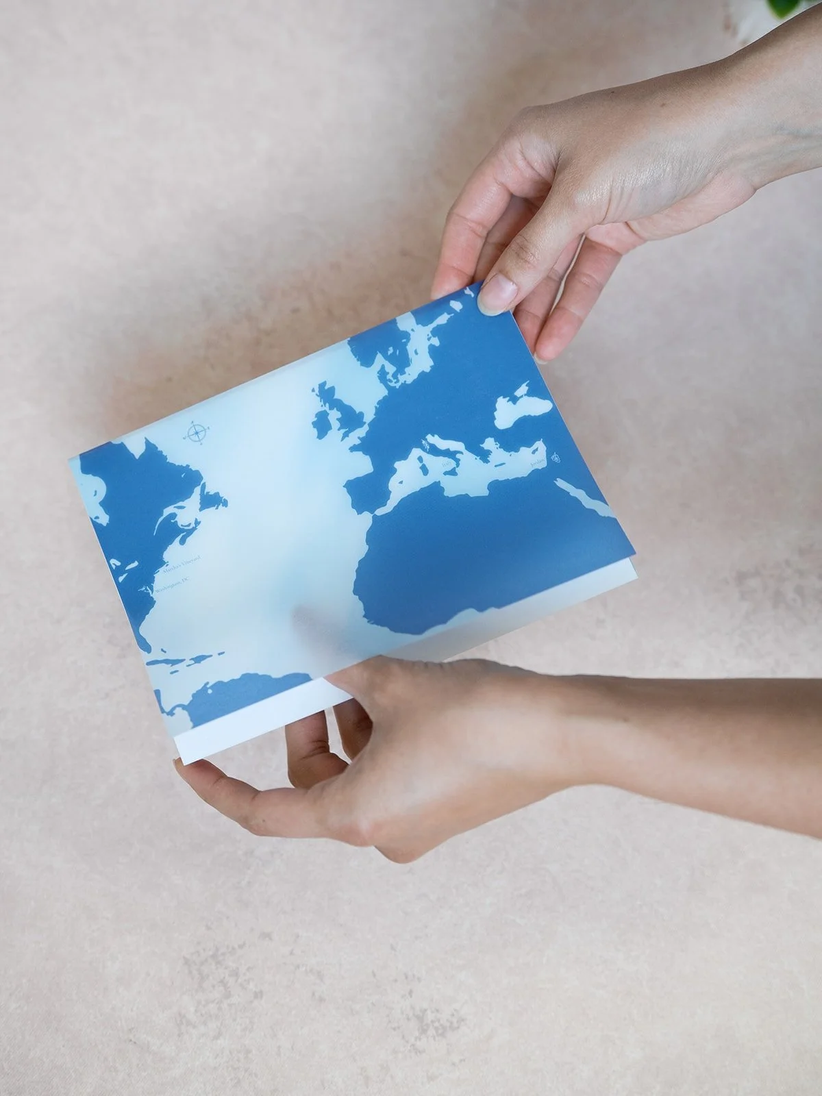
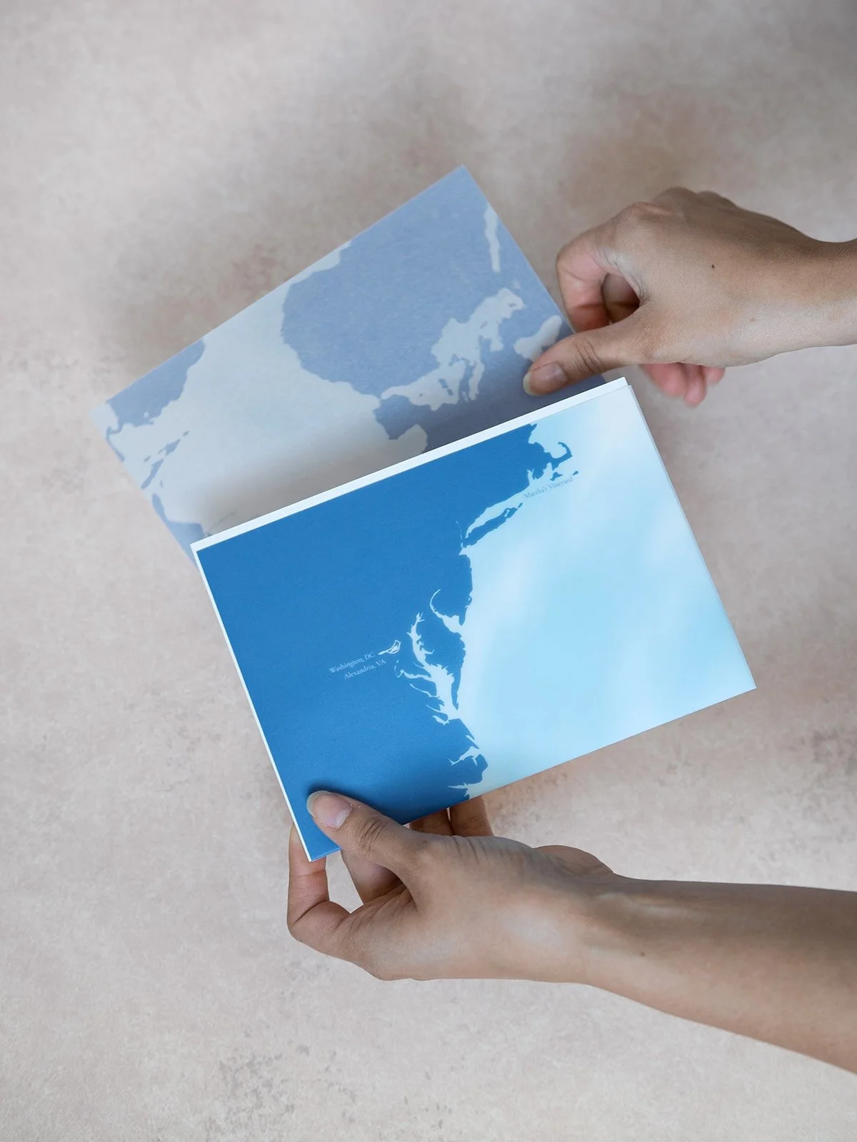
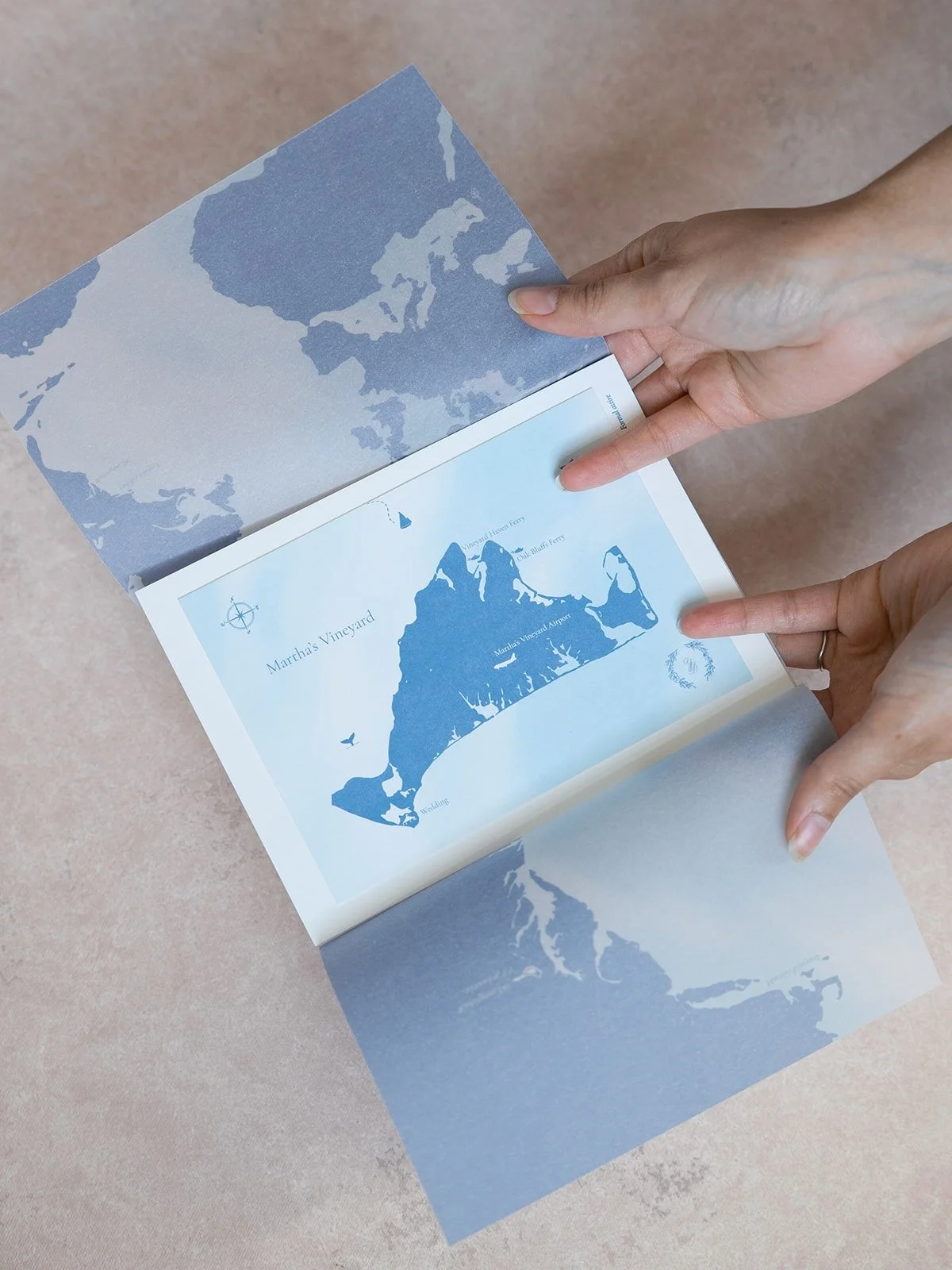
We started with their Save the Date, written in the style of a 9:30 Club announcement, with simple line illustrations featuring their hometowns, where they were engaged, and their wedding venue. They chose a modern calligraphy style and paired it with a classic font. Becky has quite the eye for color, and chose a champagne paper with a bold burgundy envelope.
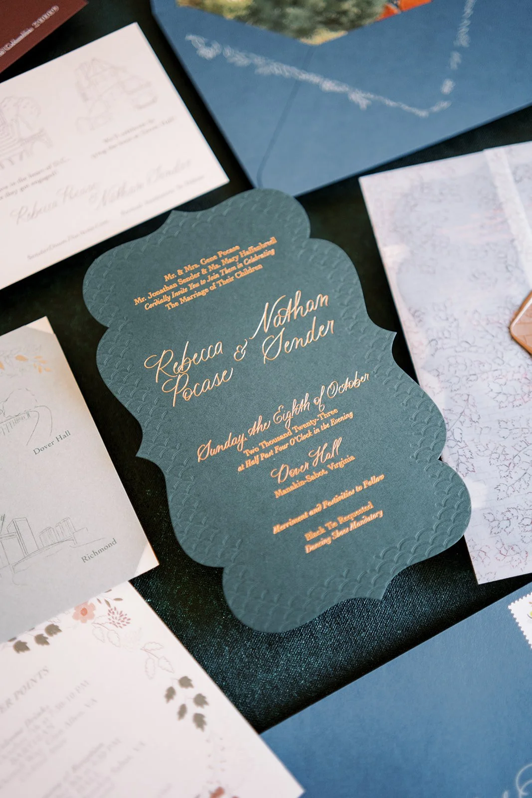
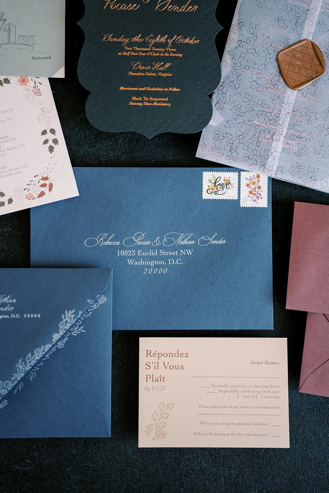
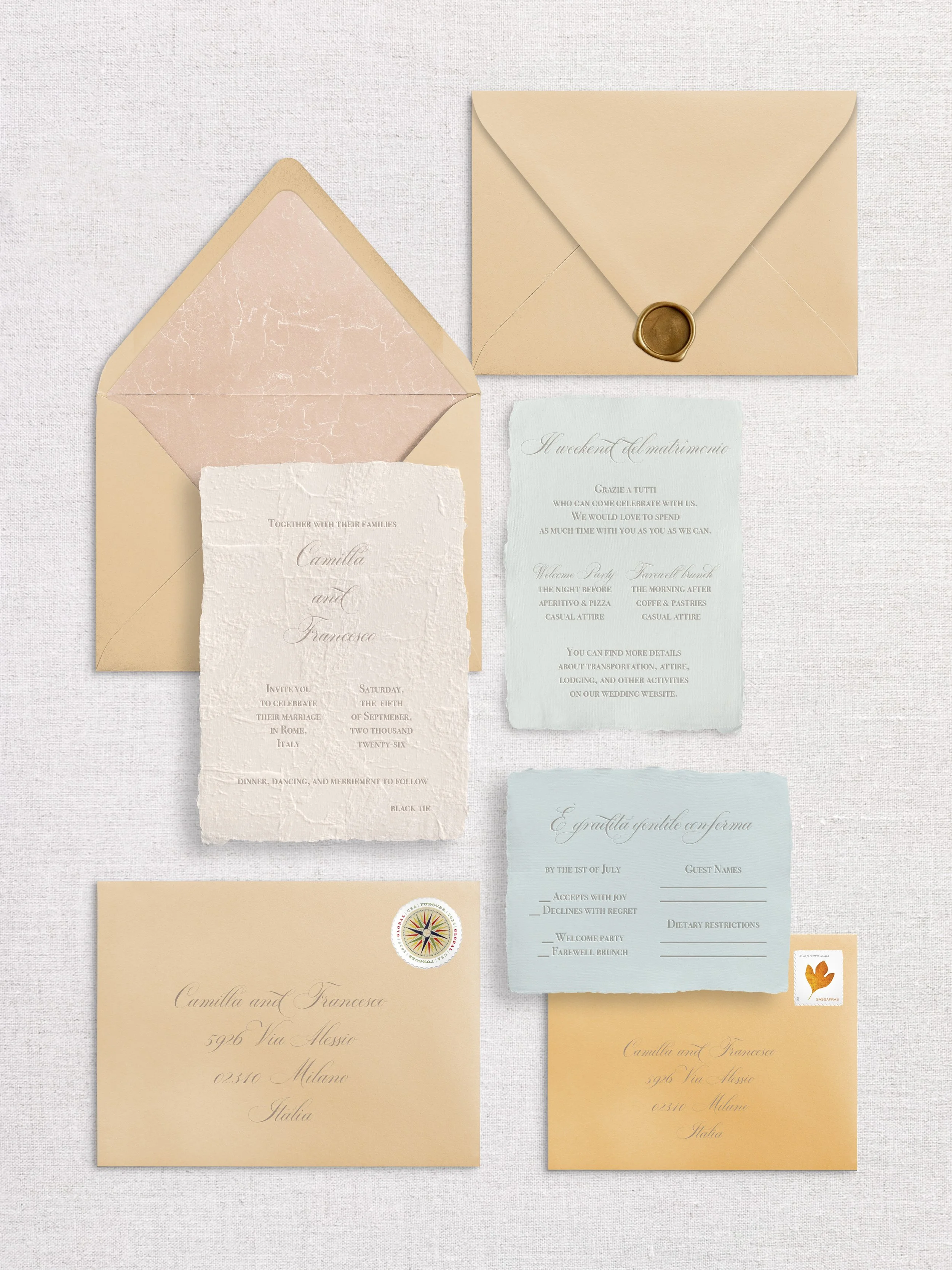
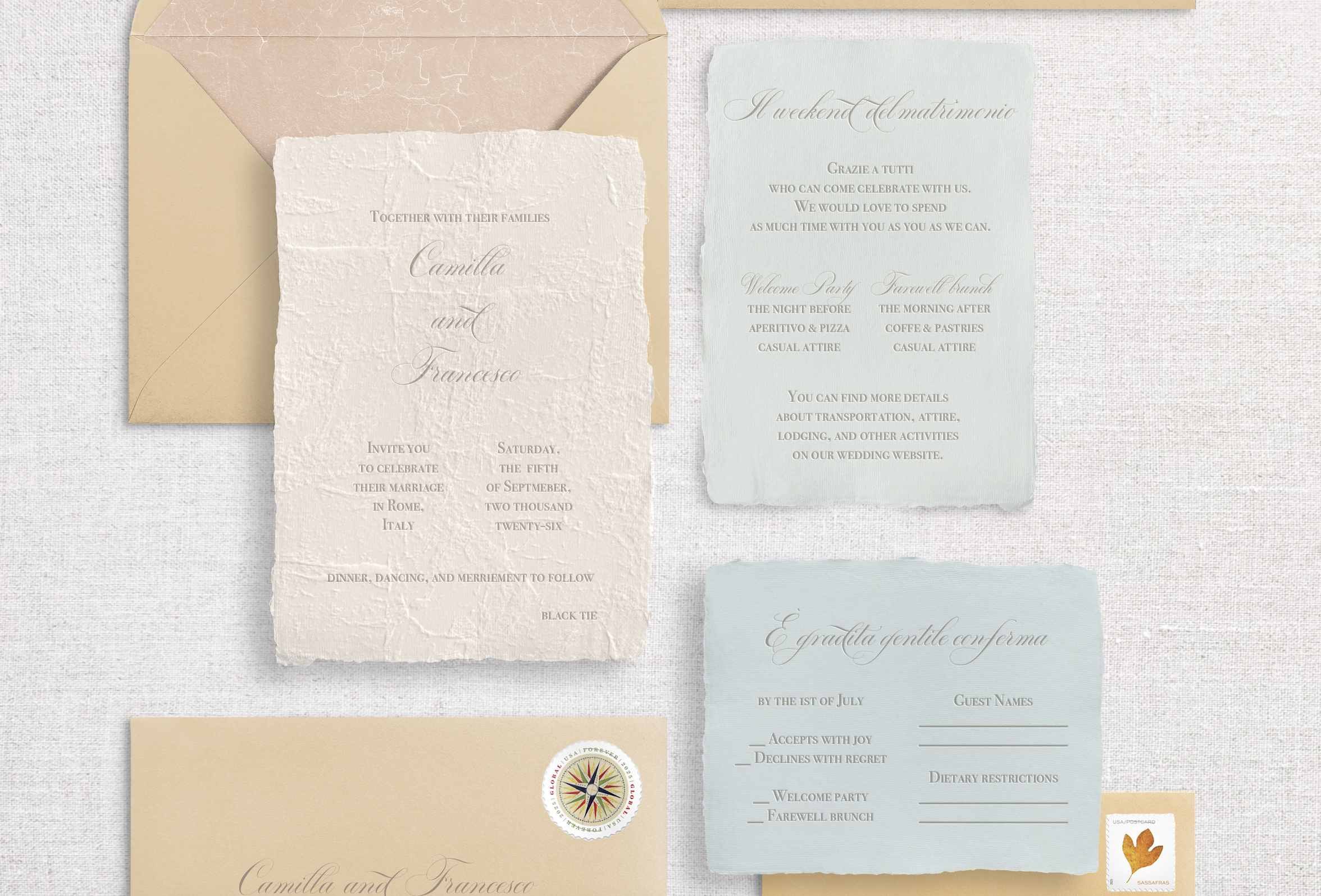
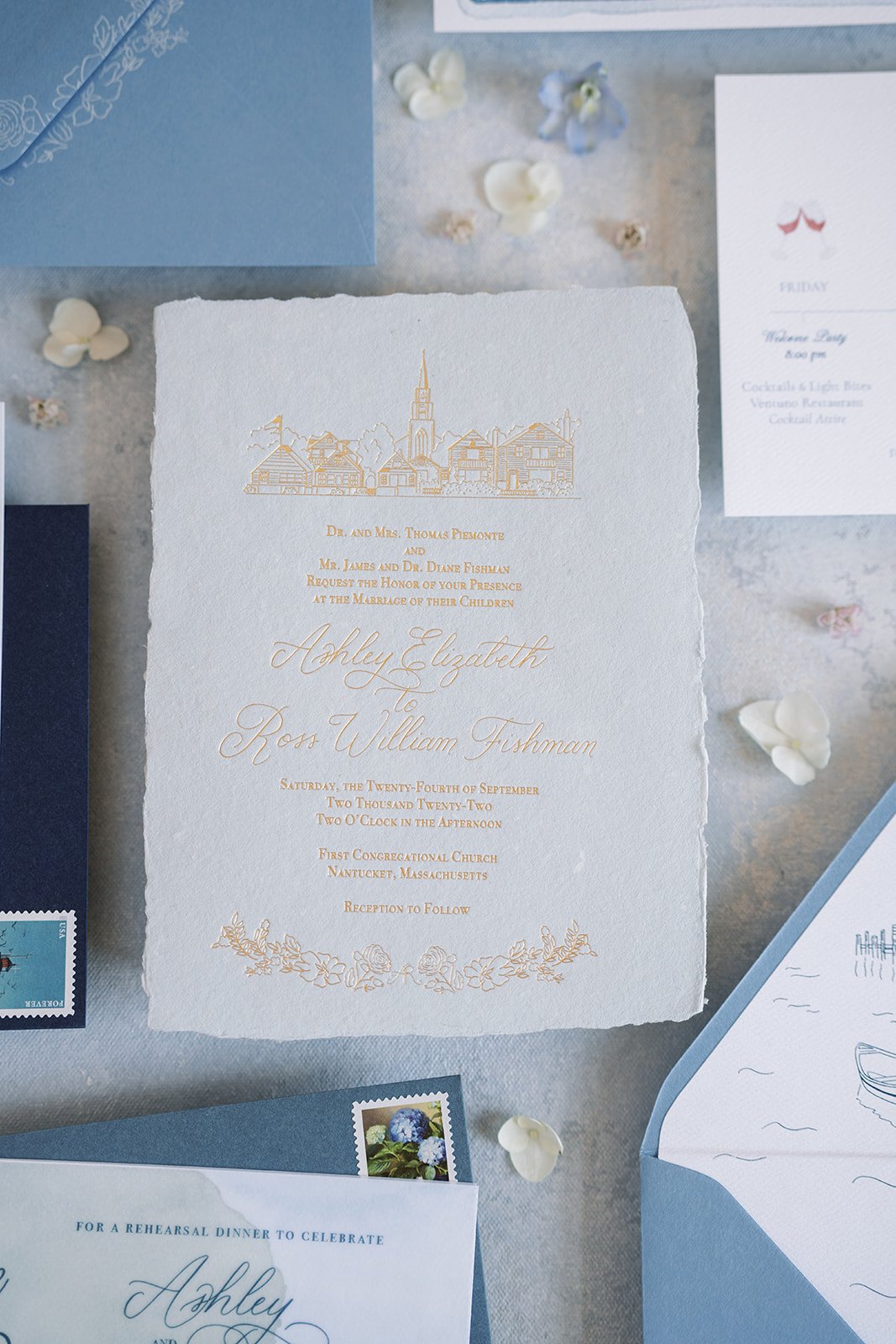
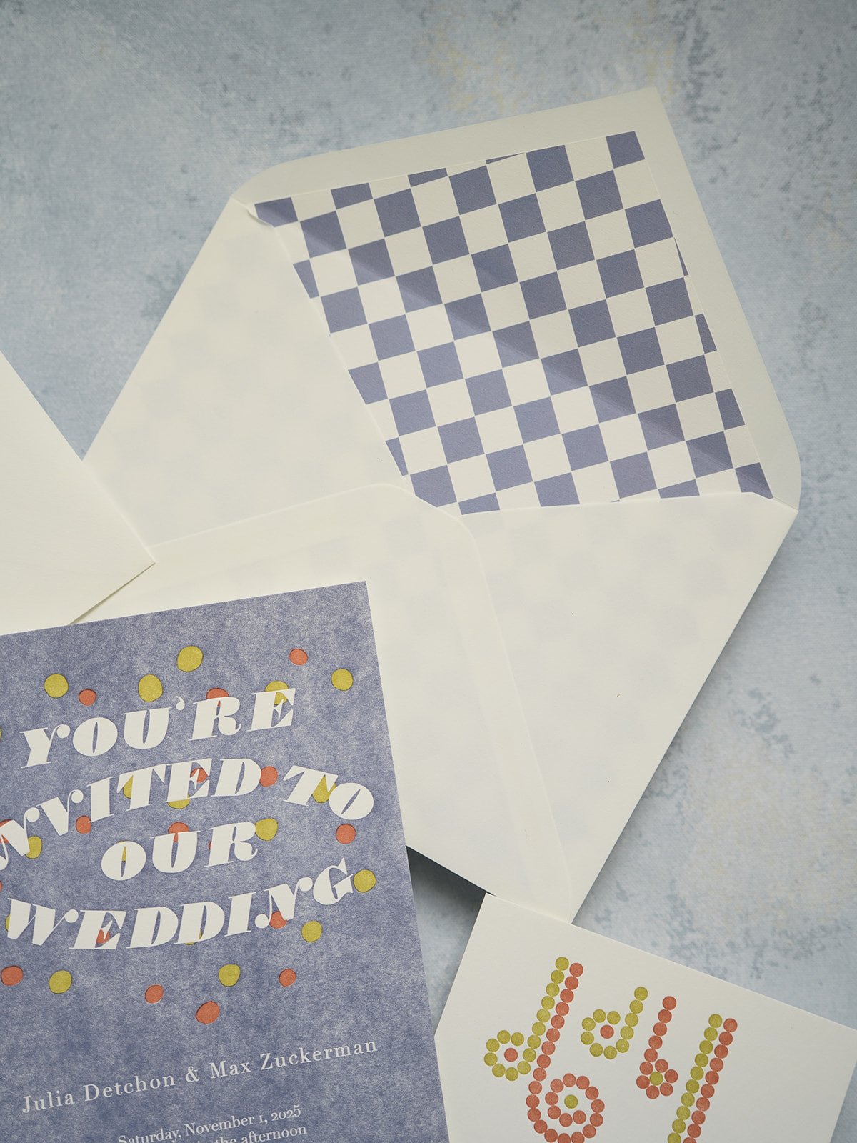
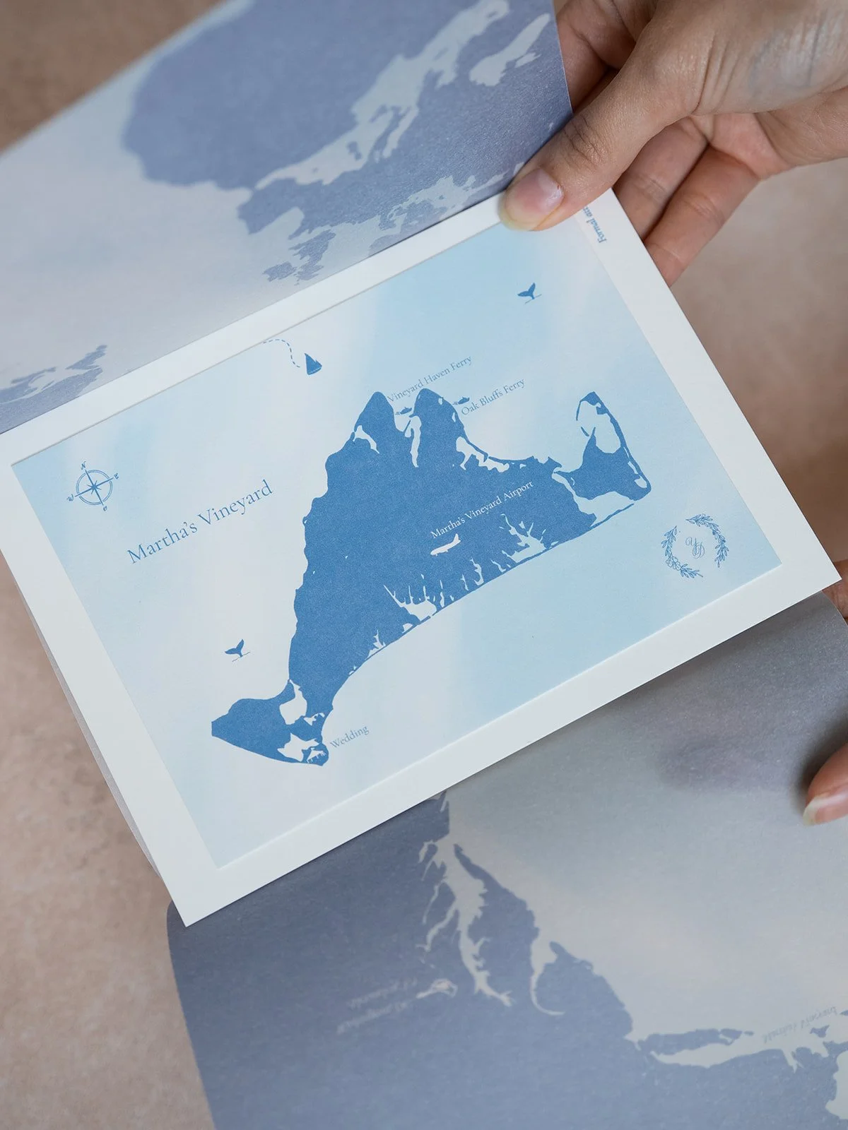
For their invitation, we pulled out all the stops. We want your Save the Date to make a statement, but your wedding invitation has to convince people that your day will be absolutely unmissable. I don’t believe in the adage “guests will just throw your invitation in the trash.” Not if it looks like this! We chose an art-deco inspired die cut, paired with a scalloped blind debossed border, and a bold copper foil on a deep green paper for a truly stunning invitation. Now of course we needed the reveal of the invitation to be even more dramatic, so I designed a vellum wrap with a subtle pattern of autumnal ivy on bricks, which would be the backdrop of their wedding ceremony. To add even more drama, I painted a watercolor of their ceremony location at Dover Hall for the envelope liner. Some clients want to stick to one design style, either watercolor or line illustration, but it can be really fun to mix both. On the back flap of the envelope, we designed a mix of their favorite flowers to give a little extra oomph at the mailbox, one of my favorite things to do.
Their detail card wasn’t only double-sided, but included two different pieces of paper. We had so many colors in their rich palette to fit in, so we took any excuse to include more. On the champagne side, we used the same flowers from the back of the envelope, but brought in some color. Then, on the sage side, we included illustrations to match and hand-painted copper flowers.
Because you can’t have too much copper, we decided to hand-paint the flaps of the response envelopes, one of my favorite details of the entire suite. It’s small touches like these that add an unexpected, playful element to your suite and really wows your guests.
Last but not least, where would we be without a wax seal? We designed a seal to use both on the Save the Date and Invitations, though in different colors. We featured their beloved dog Ollie as well as little details about the wedding day, on a brick background.
This suite was filled with color, texture, illustration, and a fun mix of non-traditional elements, while maintaining the level of formality befitting this incredible event. It was a pleasure to create this suite with Becky and Nate and remains of my favorites to this day.
Photography: Jenny Wagner Photography